
QAGCharts
QAGCharts gives Niagara 4 users a complete library of professional charts and four live table options.
Display trends, equipment comparisons, query results, report grids and historical rollups directly within your BAS interface.
Configure everything through standard Niagara properties with no custom coding.
Buy it once. Use it forever.
Current customers receive the new tables through their existing download link.
Overview
Make Building Data Easier to Understand. Zero Coding
QAGCharts for Niagara 4 brings building performance data to life through customizable charts, tables, and visual indicators designed for Building Automation Systems (BAS). Transform complex operational data into clear, interactive visualizations that help users monitor equipment, identify trends, compare performance, and understand system behavior over time. With flexible configuration options and a cohesive visual presentation, QAGCharts helps create more informative, intuitive BAS interfaces tailored to your building’s needs.
18 Chart Types. Full Customization. Zero Coding.
Chart Categories
- Trends & Time Series: Line Chart, Sparkline, Comparison, Candlestick, Theme River
- Category & Proportion: Bar Chart, Pie Chart, Funnel, Treemap
- Real-Time Status: Gauge (6 styles), KPI Card, Totals (6 agg modes), Liquid Fill
- Advanced Analytics: Scatter (regression), Heatmap (3 modes), Radar, Sankey, Boxplot
Built For
Energy Management • Operations Centers • Executive Reporting • Commissioning & FDD • Tenant Engagement
Charts
Visualize Trends. Understand Performance.
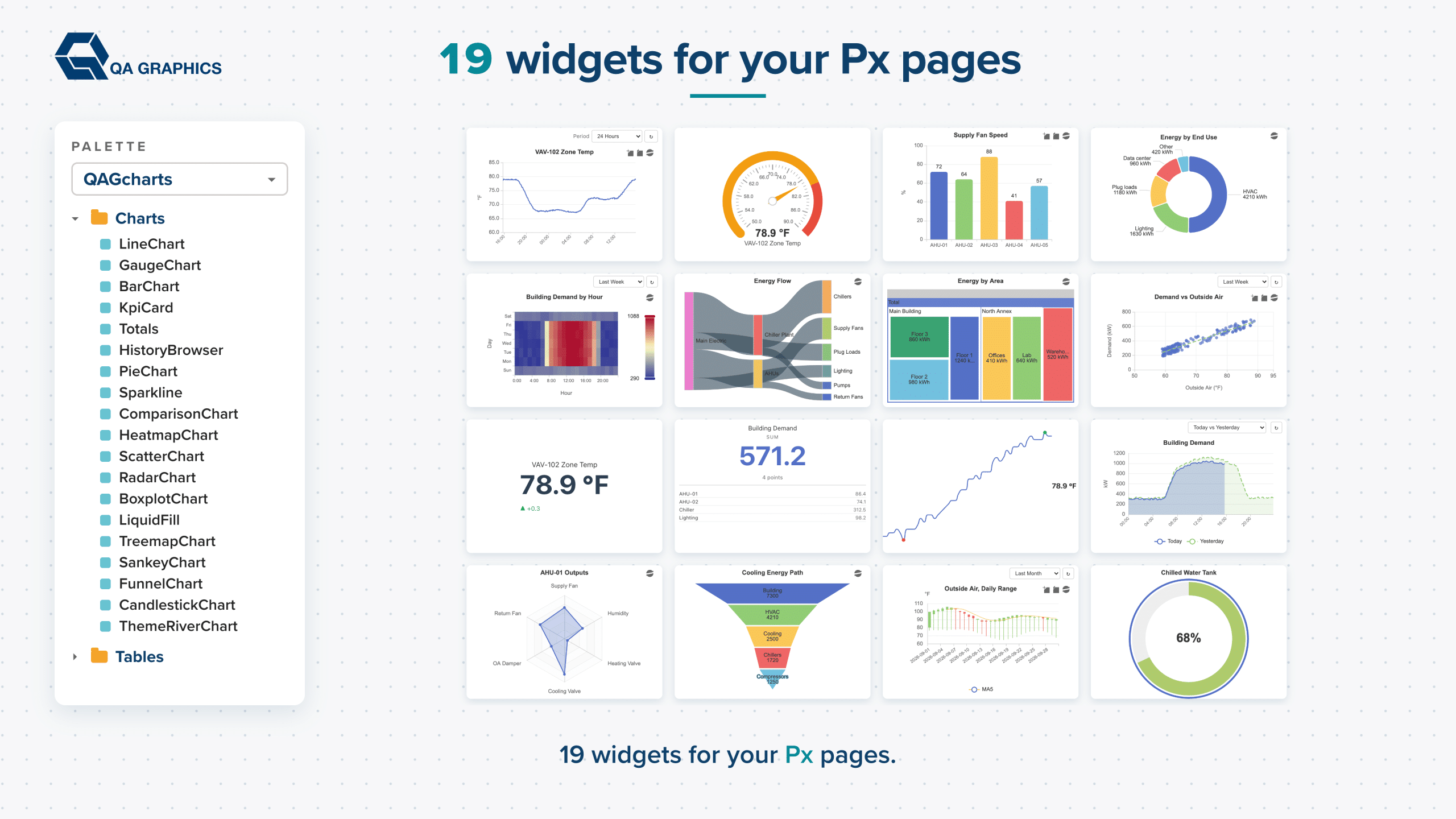
Turn raw building data into meaningful visual insights with QAGCharts for Niagara 4. Choose from a variety of chart widgets to display system performance, historical trends, energy usage, and other important operational data. Configure chart properties, labels, colors, and data sources to fit your application and make information easier to interpret at a glance.
With flexible drag-and-drop configuration and data binding options, charts can be integrated into your Niagara 4 pages to create a more interactive and informative user experience. From monitoring temperature trends to visualizing energy demand and comparing system performance, QAGCharts helps make building data more accessible and useful.
Tables
Organize Data. Simplify Analysis.
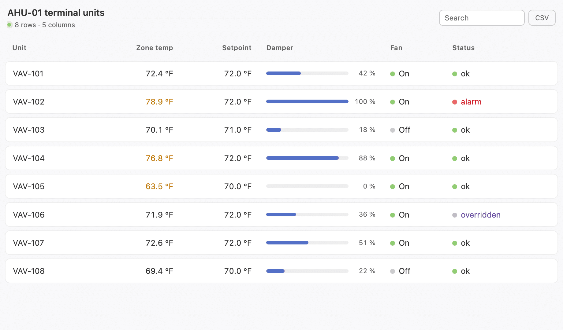
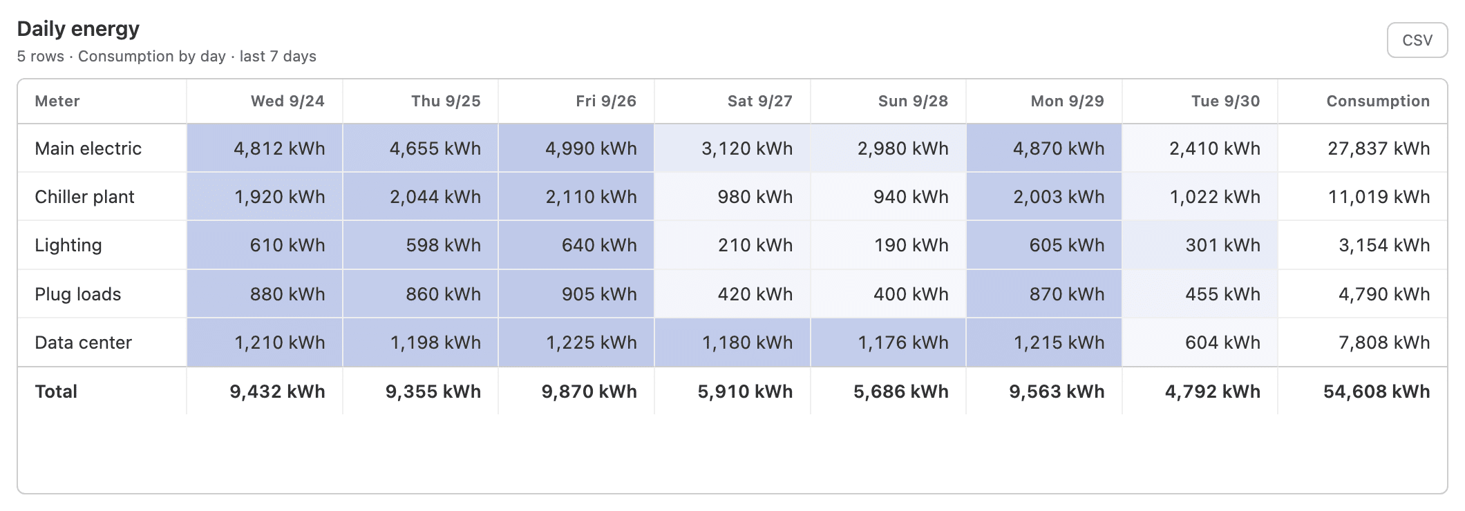
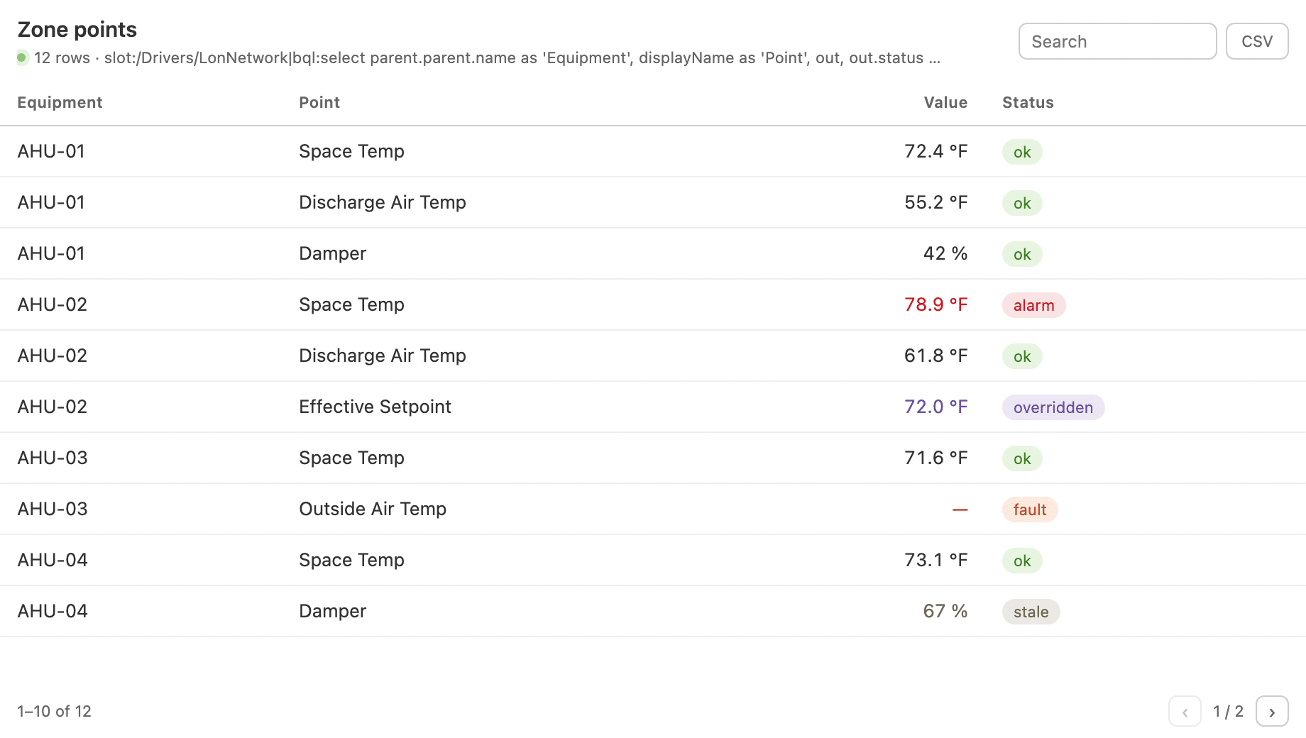
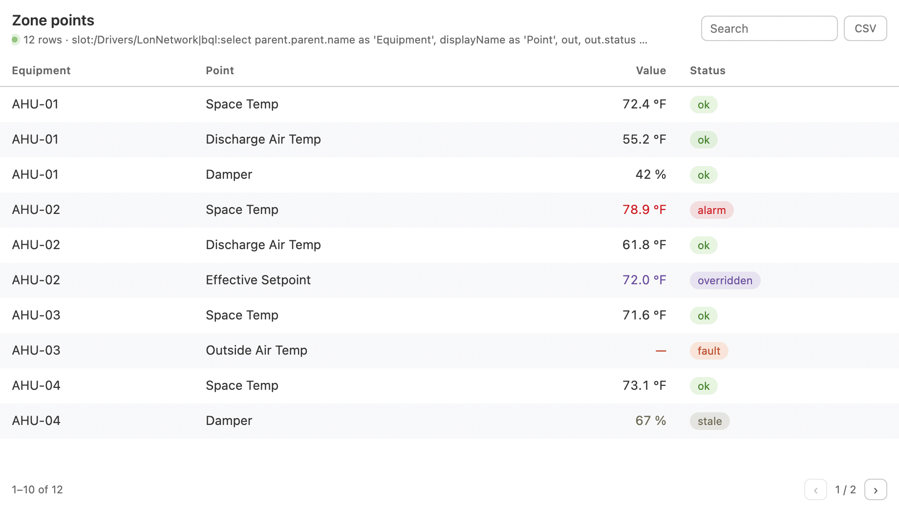
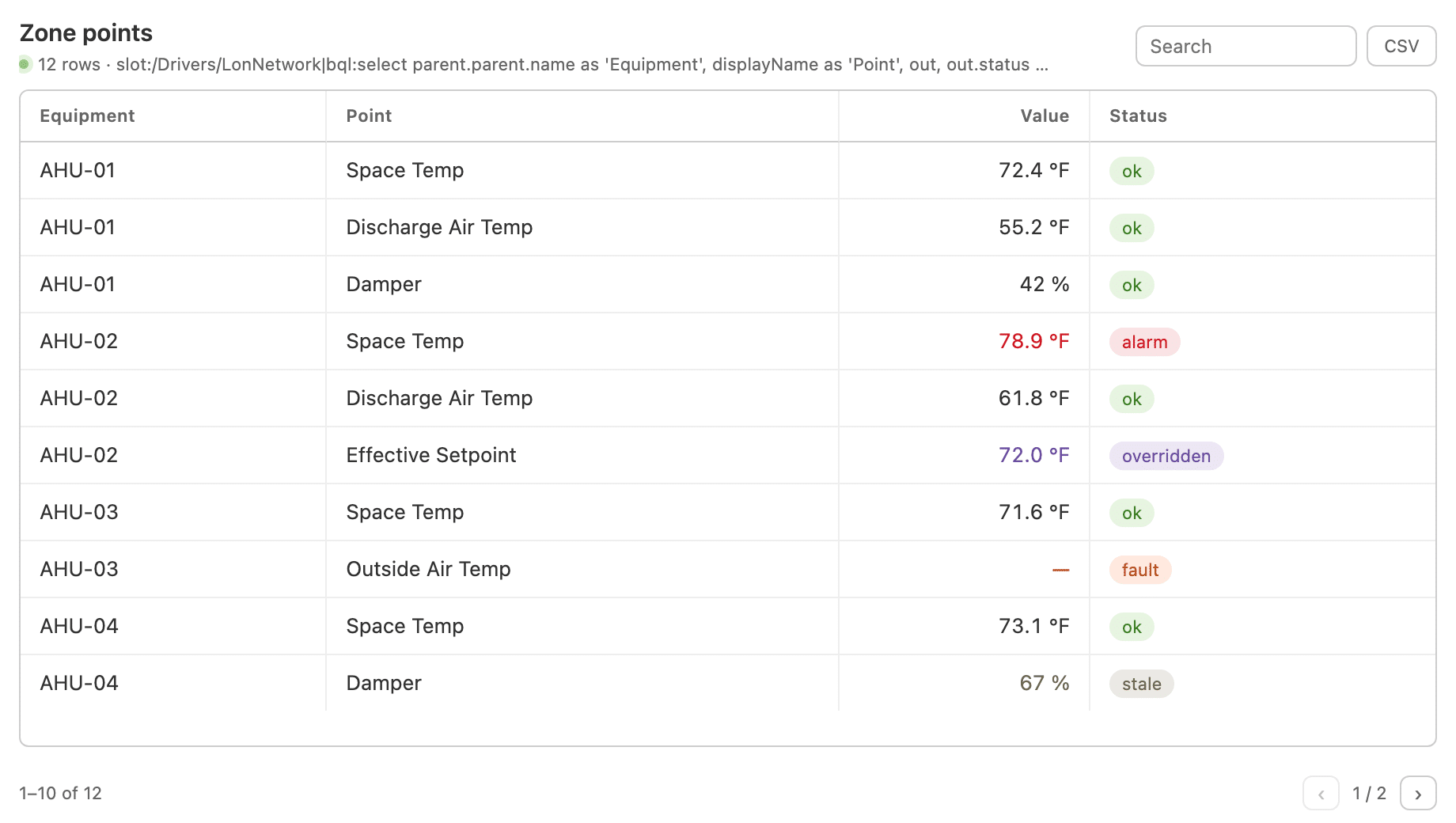
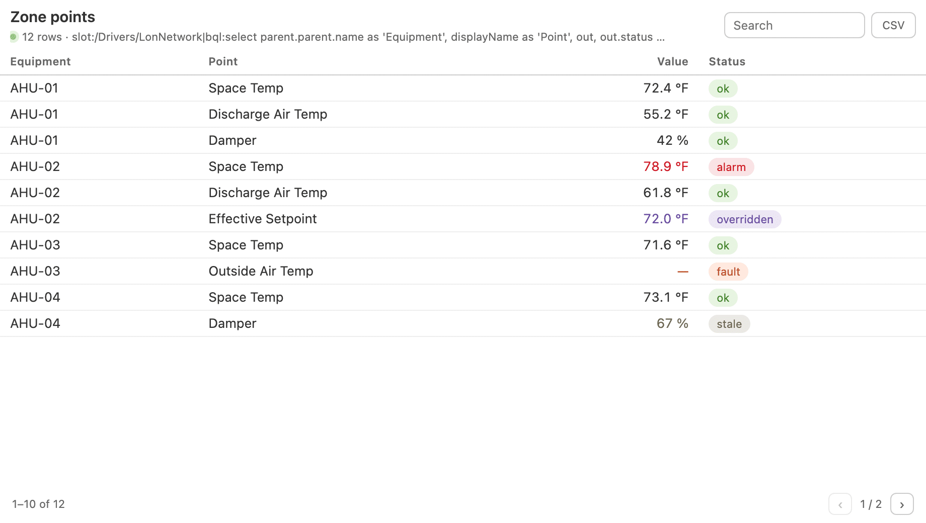
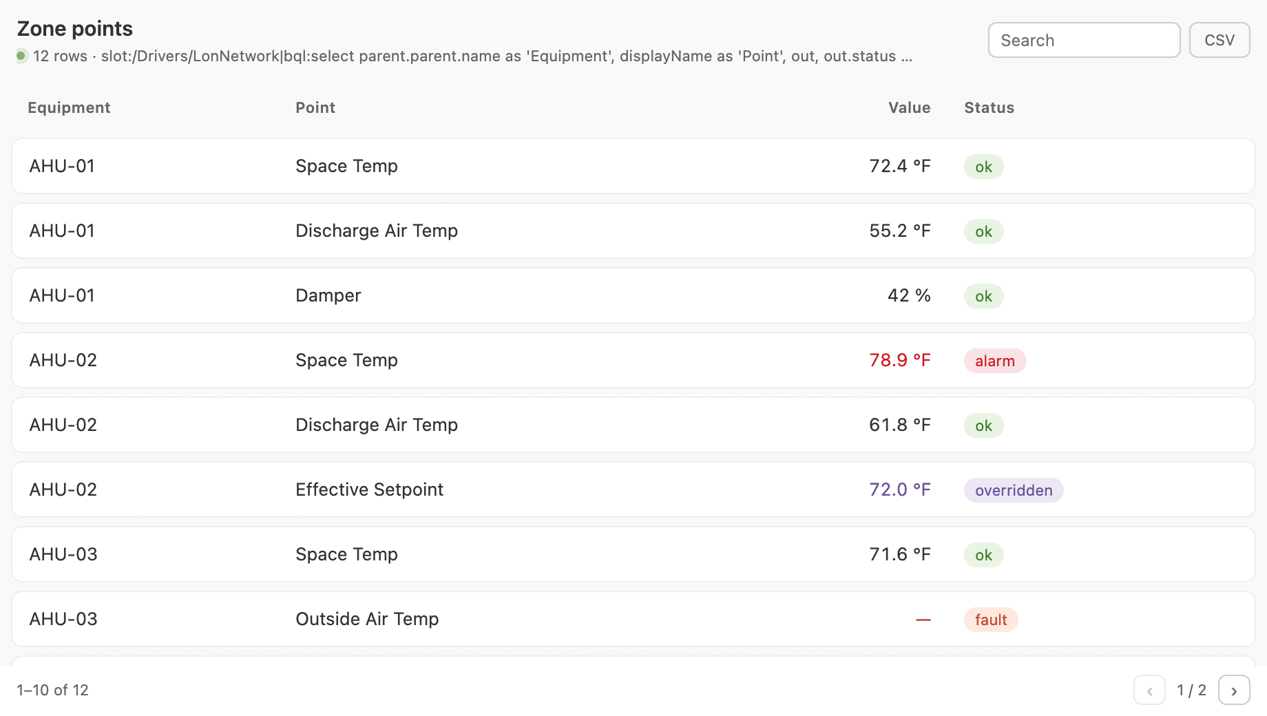
Present important building information in structured, easy-to-read tables that complement your charts and BAS graphics. QAGCharts for Niagara 4 includes table options designed to organize current values, historical information, equipment data, and summarized reports in a clear, consistent format.
Display key operating values, compare readings across equipment, review historical data, and highlight important status conditions. With table styles that coordinate with your chart visualizations, you can create a unified interface that makes it easier for operators to locate information, recognize changes, and review building performance.
Themes
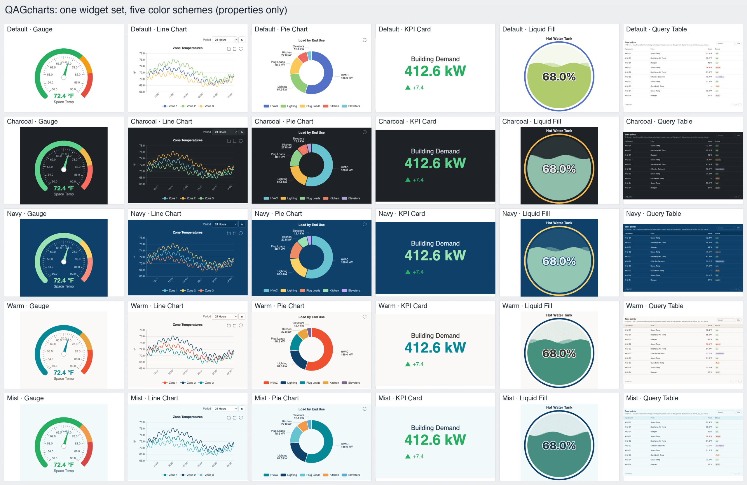
A Consistent Look Across Every Interface
Create a visual experience that reflects your organization’s standards and supports the way your team works. QAGCharts for Niagara 4 offers customization options for chart and table appearance, including colors, labels, and other display properties. Design interfaces that align with your existing BAS graphics, whether you prefer a light or dark presentation or want to incorporate your organization’s brand colors.
Consistent styling helps charts, tables, and system data feel like part of one cohesive interface. Use visual indicators and status colors to distinguish operating conditions, draw attention to important values, and make information easier to scan. The result is a more organized, professional BAS experience that balances visual consistency with practical functionality.
What’s Included
Charts
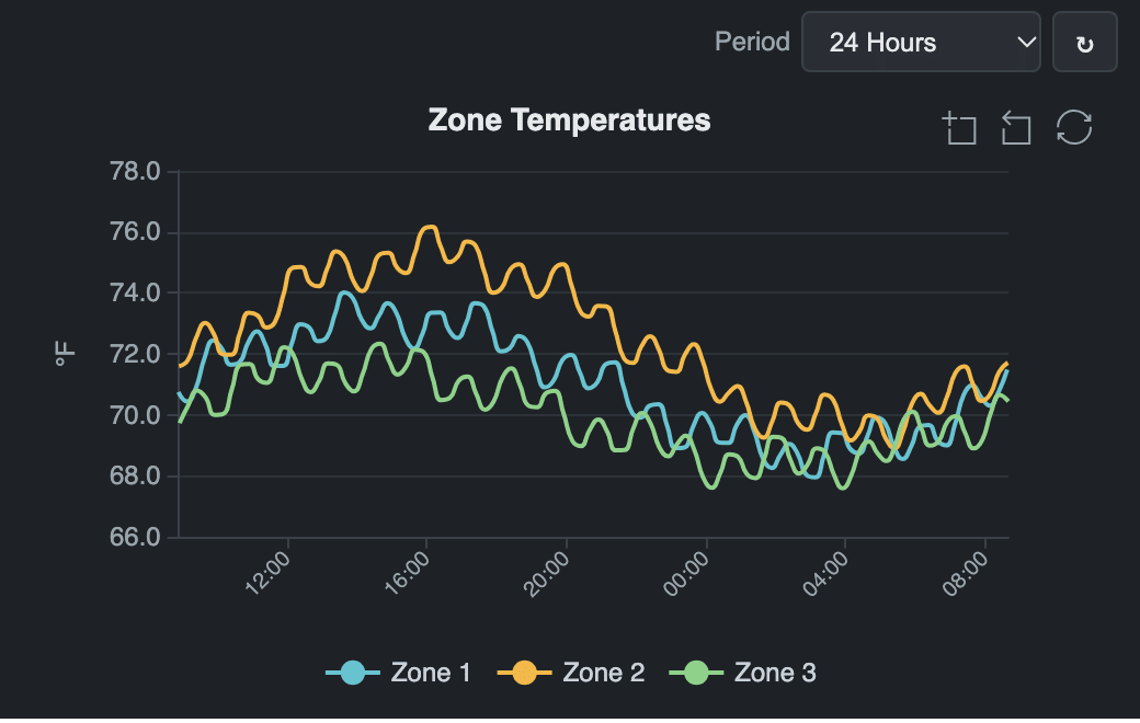
- Line Chart
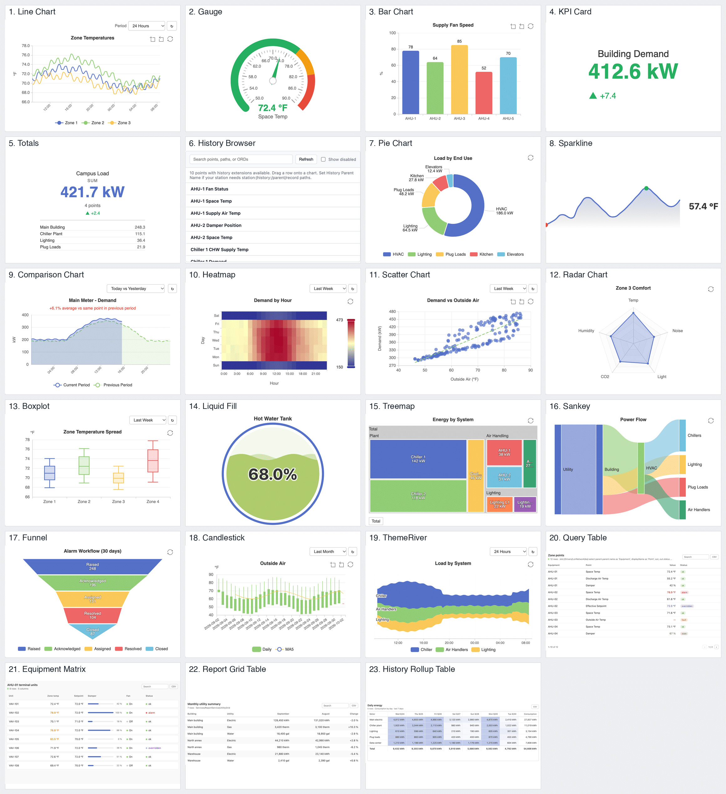
Track point history over a selected time period with an interactive line chart. Zoom in to explore trends, patterns, and changes in detail. - Gauge
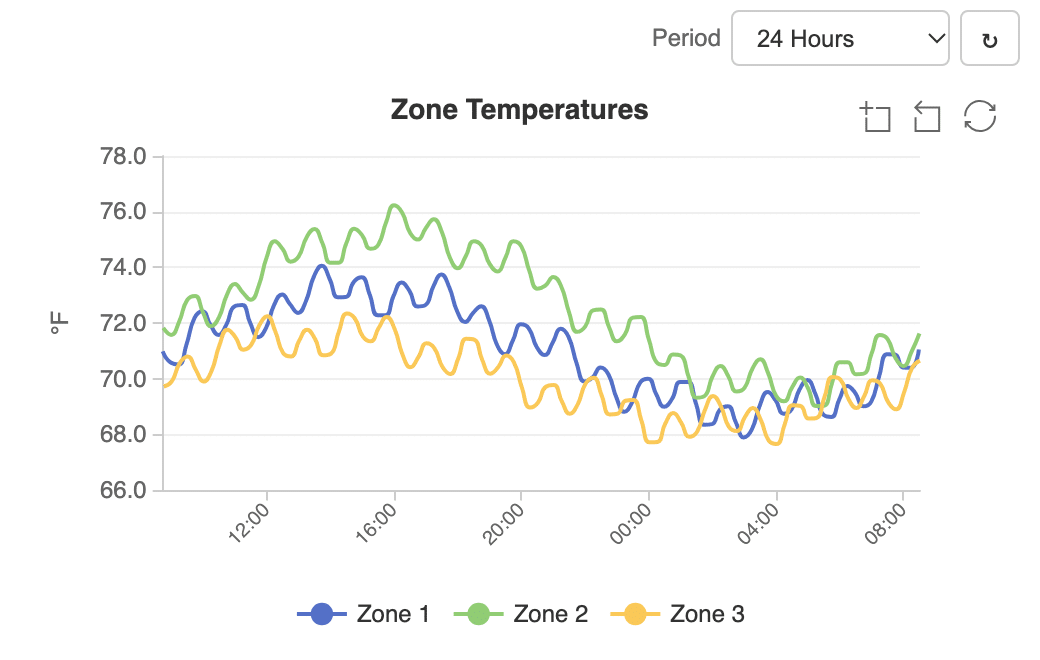
Monitor a live value with an easy-to-read dial or linear gauge. Color-coded warning and alarm thresholds make status immediately visible. - Bar Chart
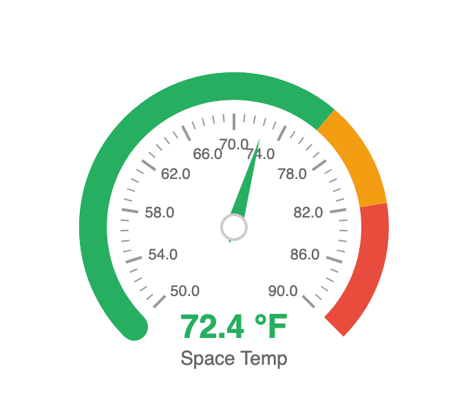
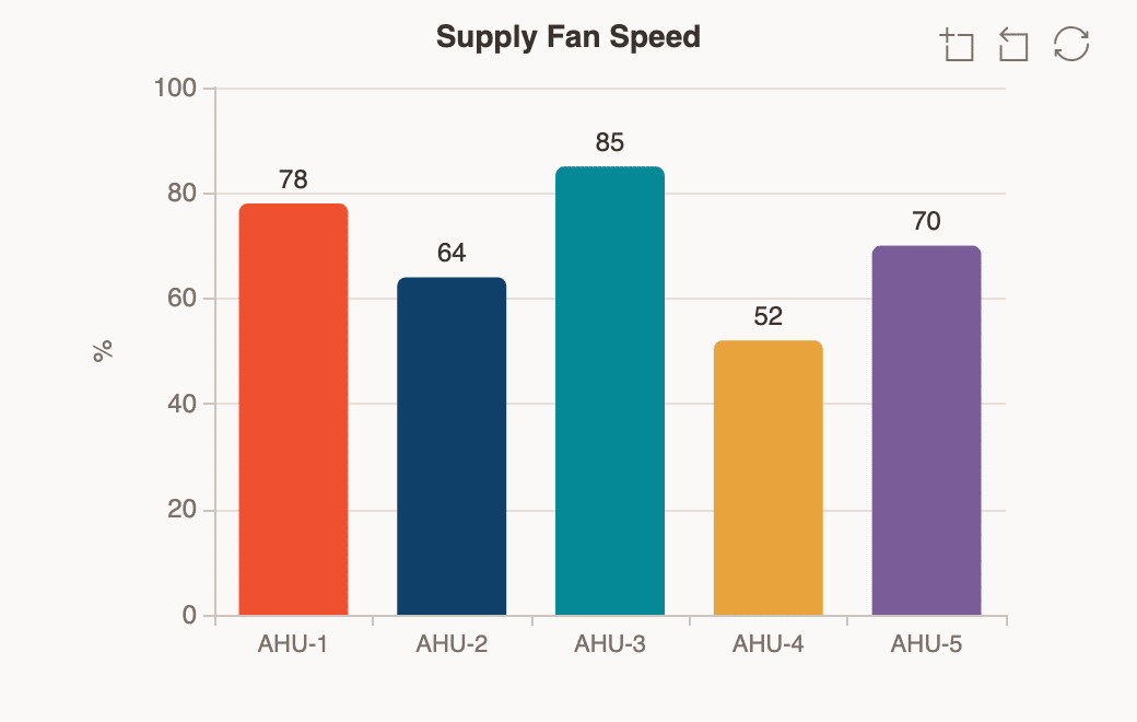
Compare multiple live values side by side with a clear bar chart. Quickly identify differences and relative performance across points. - KPI Card
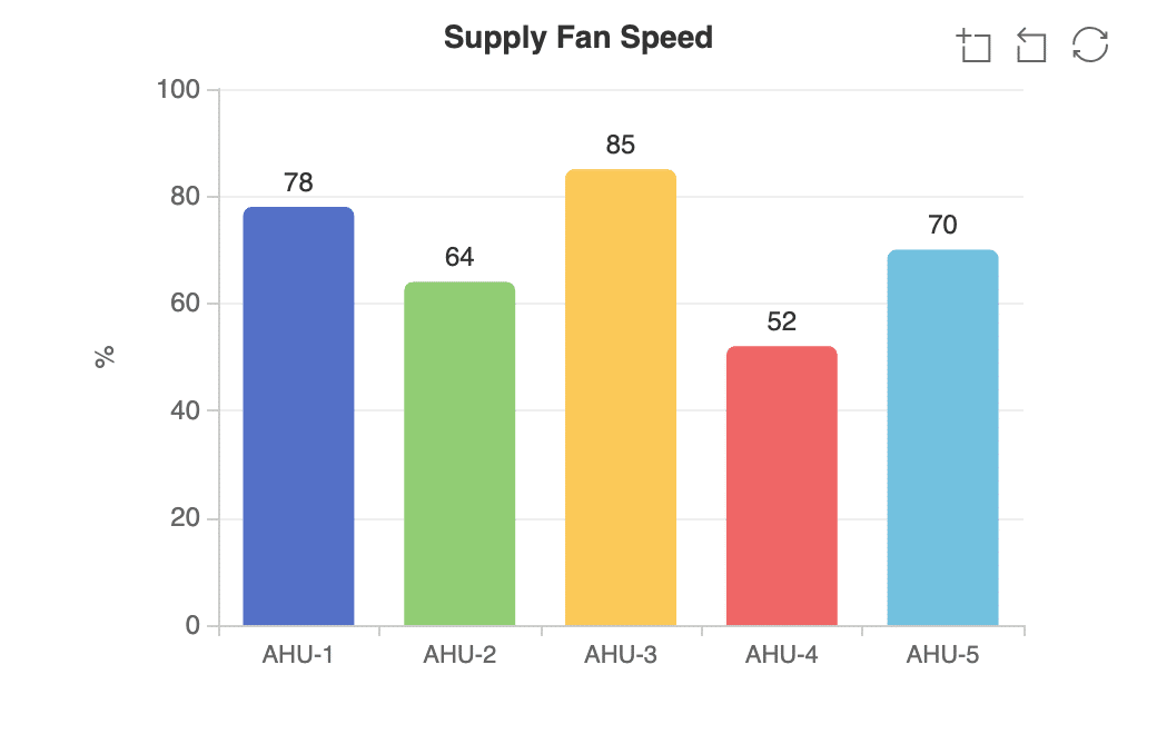
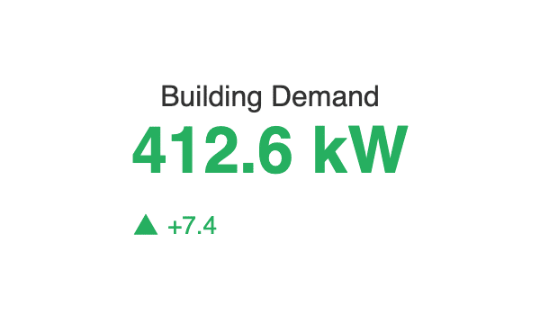
Highlight a single live value with large, easy-to-read typography. Threshold-based colors show status while the latest change provides additional context. - Totals
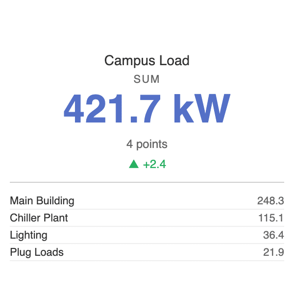
Summarize multiple live points using totals, averages, minimums, maximums, counts, or ranges. View a detailed breakdown to understand the underlying values. - History Browser
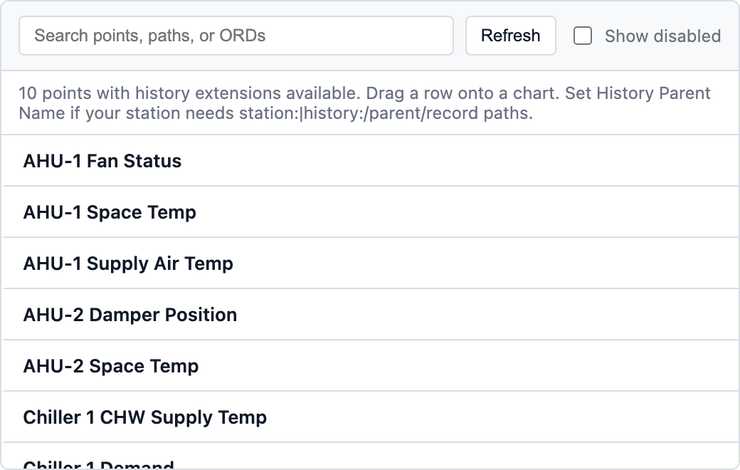
Browse station points with available historical data in one convenient view. Drag a point onto a chart to quickly bind it and explore its history. - Pie Chart
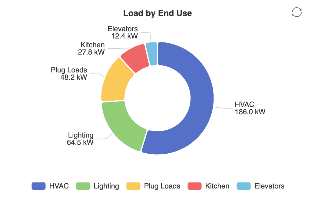
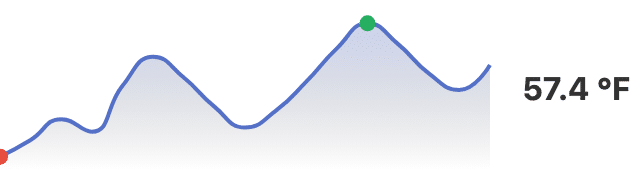
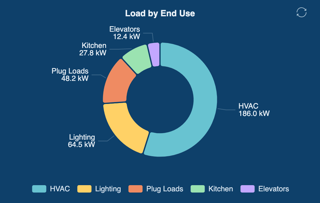
Visualize how live values contribute to a whole with a pie or donut chart. Quickly understand proportions and the share represented by each point. - Sparkline
Monitor a compact live trend for a single point without taking up valuable dashboard space. View the current value alongside its recent trend. - Comparison Chart
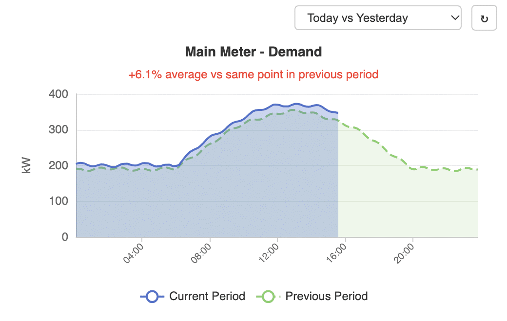
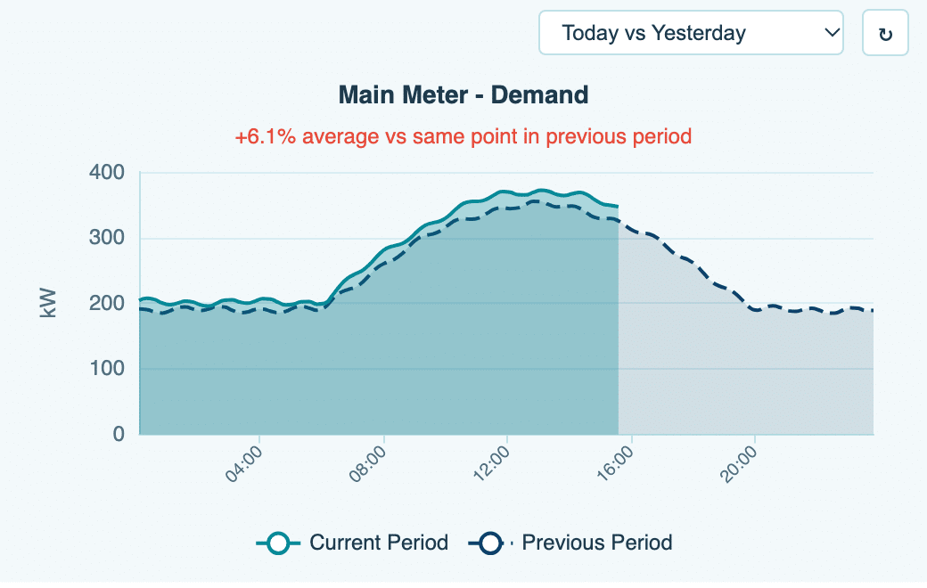
Compare the current period with the previous period to quickly identify changes. View the average percentage change for additional context. - Heatmap
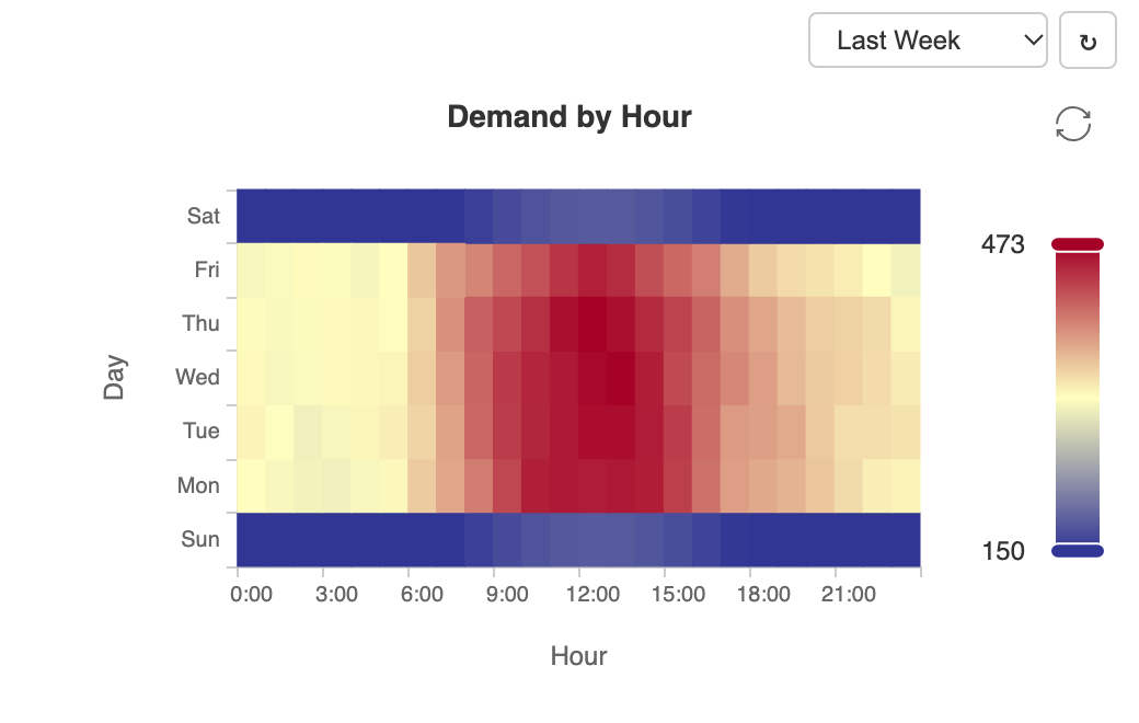
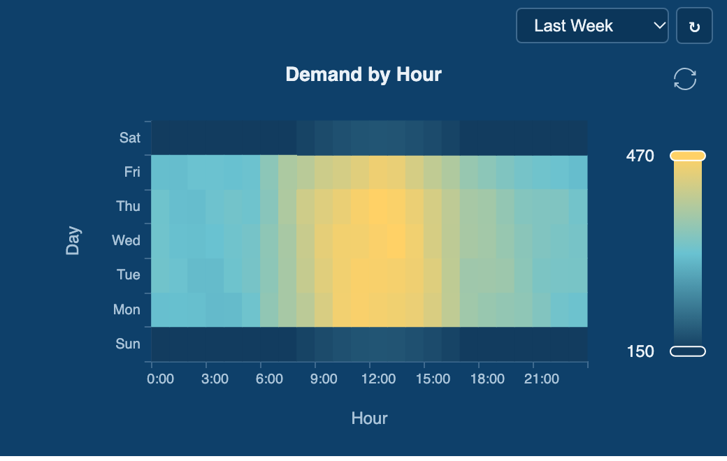
Explore historical patterns with data organized by hour of day and weekday. Quickly identify recurring periods of high, low, or changing activity.
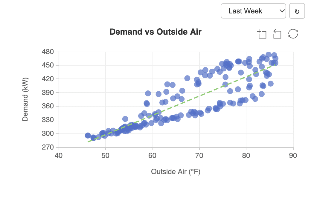
- Scatter Chart
Compare two historical data sets to explore relationships and patterns. Add a trend line to help visualize correlations between points. - Radar Chart
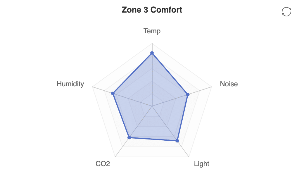
Compare several live values together in a single spider chart. Each value uses its own scale to provide a clear view across multiple measurements. - Boxplot
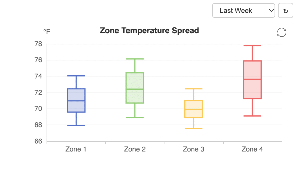
Analyze the distribution of historical data for each point. View minimum, quartiles, median, and maximum values to understand range and variation. - Liquid Fill
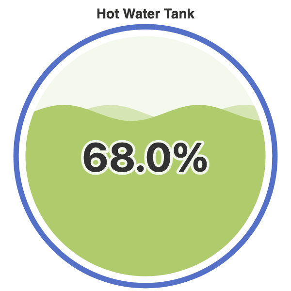
Monitor tank or vessel levels with an intuitive animated fill visualization. The flowing wave provides a clear, immediate view of the current level. - Treemap
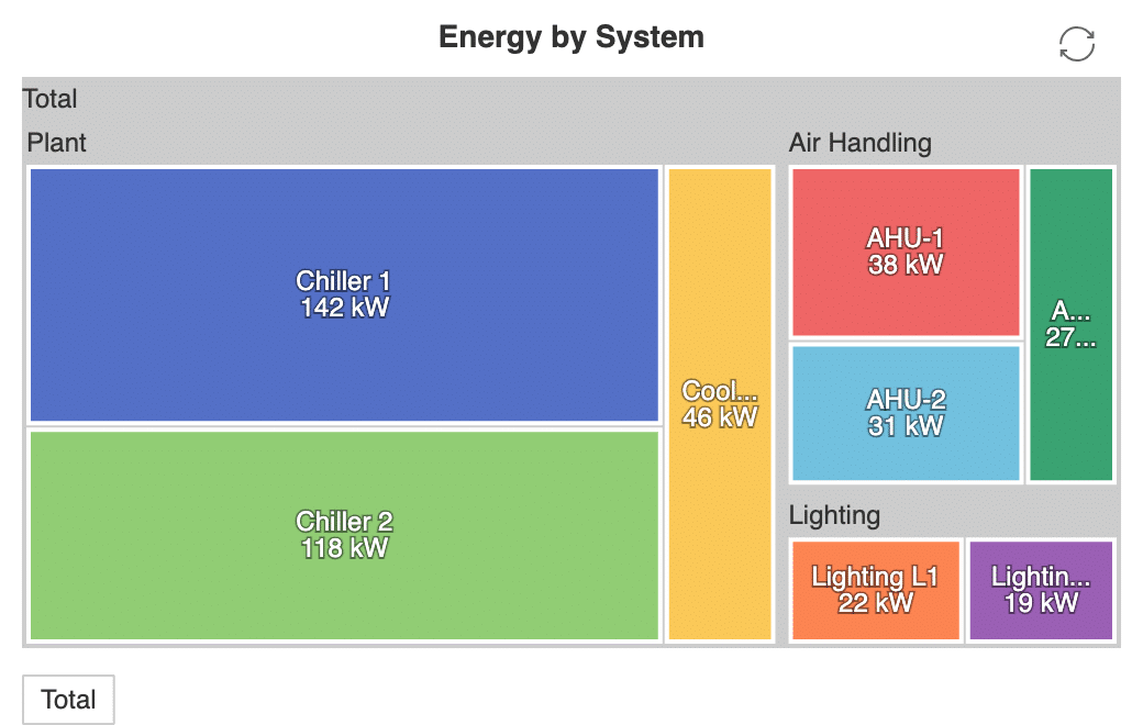
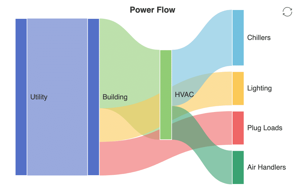
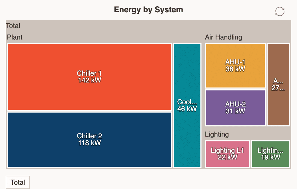
Visualize live values as proportional rectangles for an easy-to-scan overview. Group related values by parent to clearly display hierarchical data. - Sankey
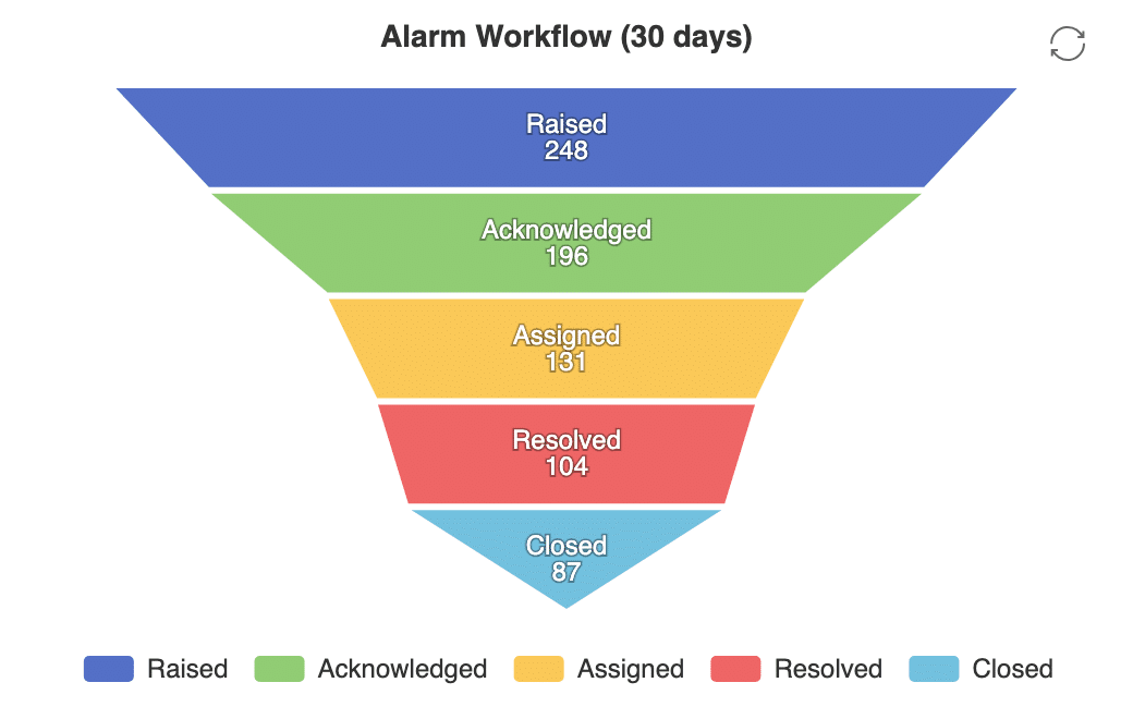
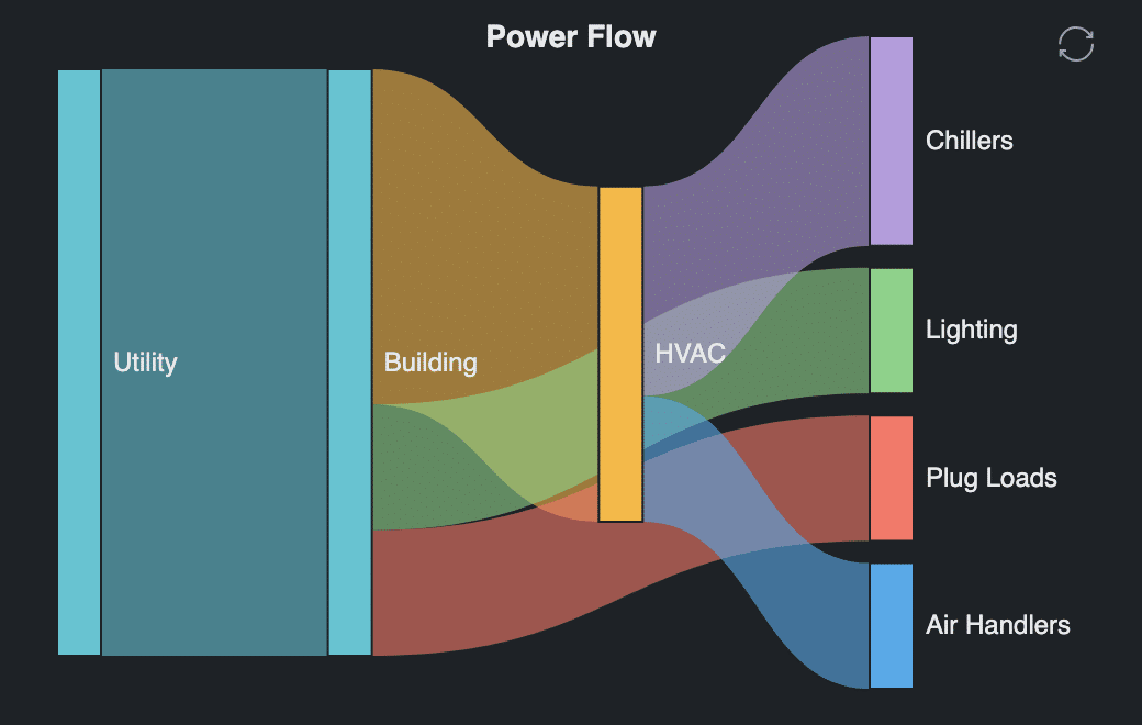
Visualize how resources or values flow between connected systems and nodes. Follow flows from utilities and buildings through individual systems. - Funnel
Visualize values across sequential process stages with each stage sized according to its value. View each stage as a percentage of the starting point. - Candlestick
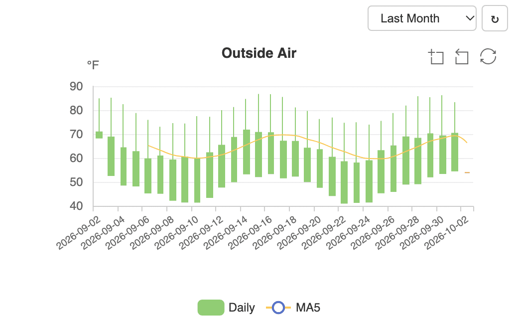
Analyze daily historical data using open, high, low, and close values. Add moving averages to compare daily activity with longer-term trends. - ThemeRiver
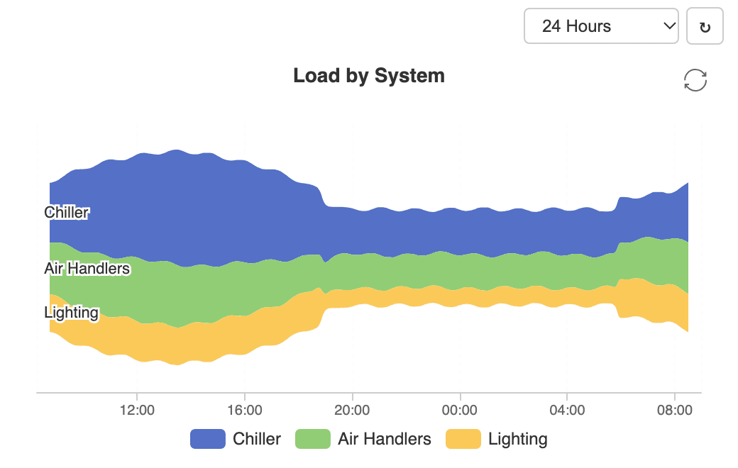
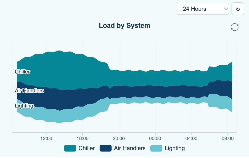
Explore multiple historical trends as flowing, stacked streams over time. See how individual values change and contribute to the overall picture.
Tables
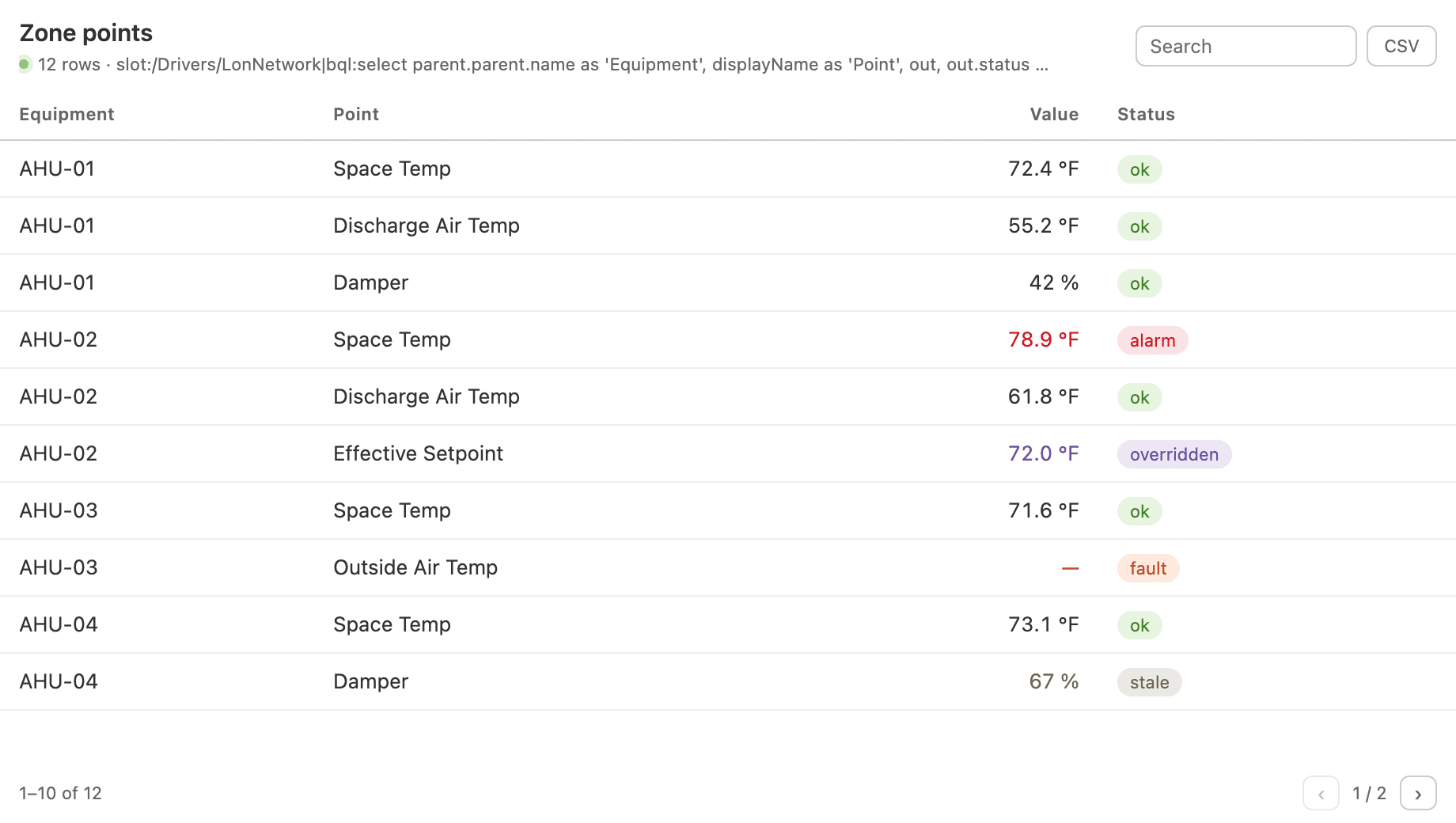
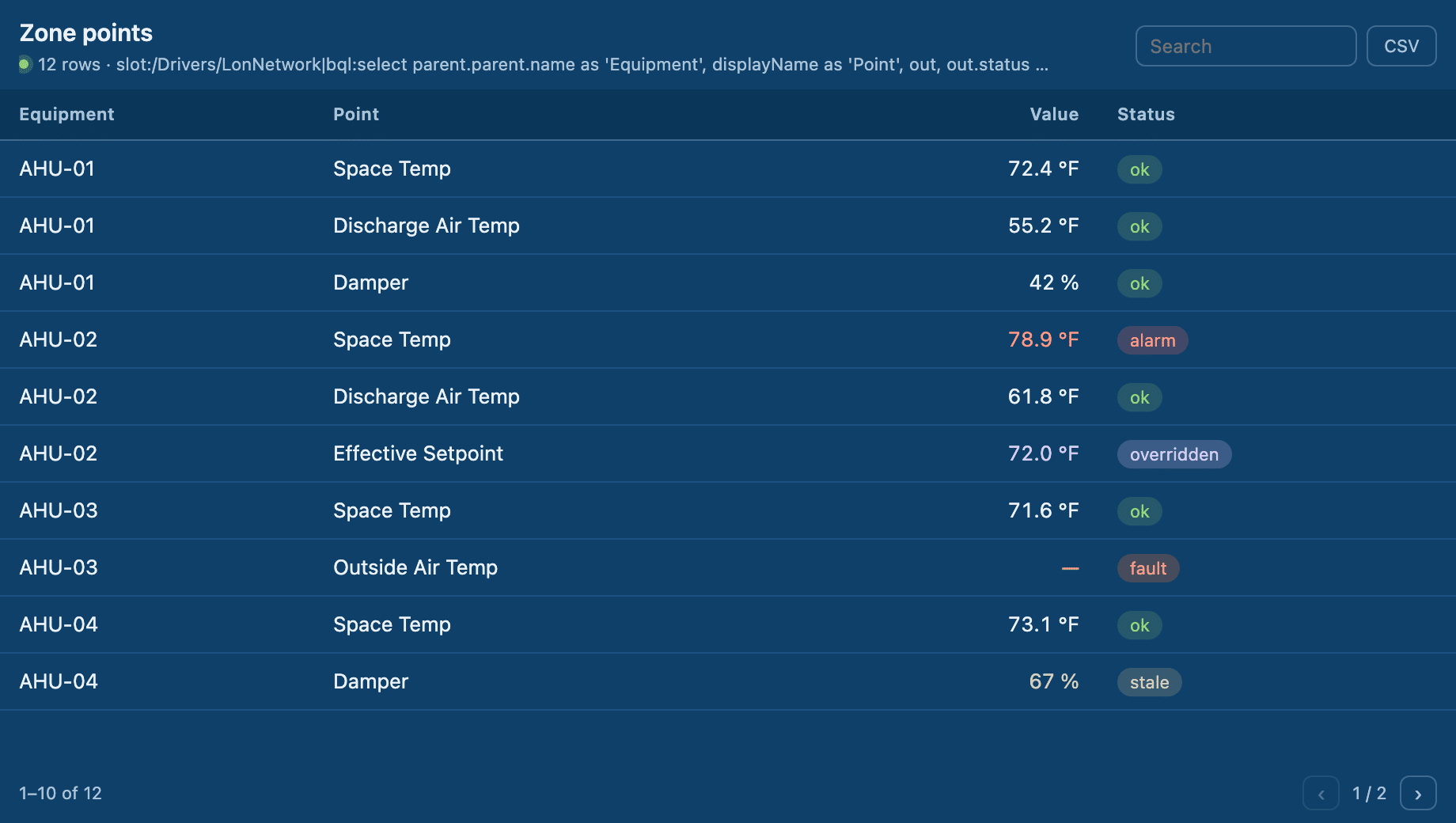
- Query Table
Display BQL/NEQL query results in a live, interactive table. Sort and search the results to quickly find and analyze the information you need. - Equipment Matrix
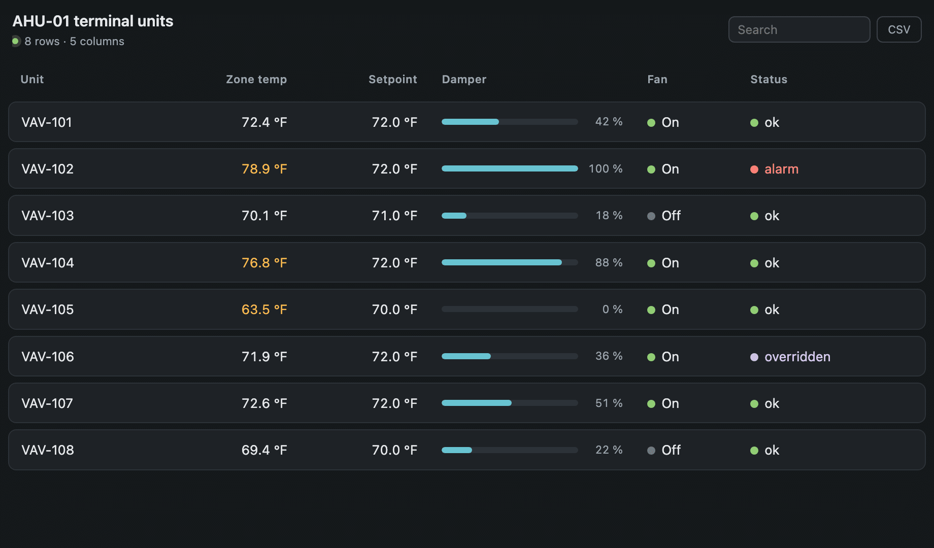
View equipment data in a structured matrix with one row per piece of equipment. Columns display associated point values for quick comparison across assets.
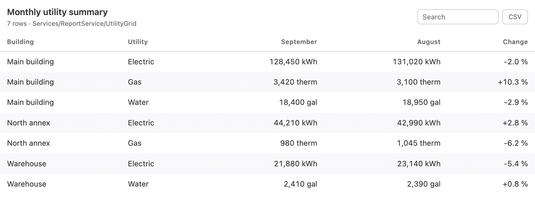
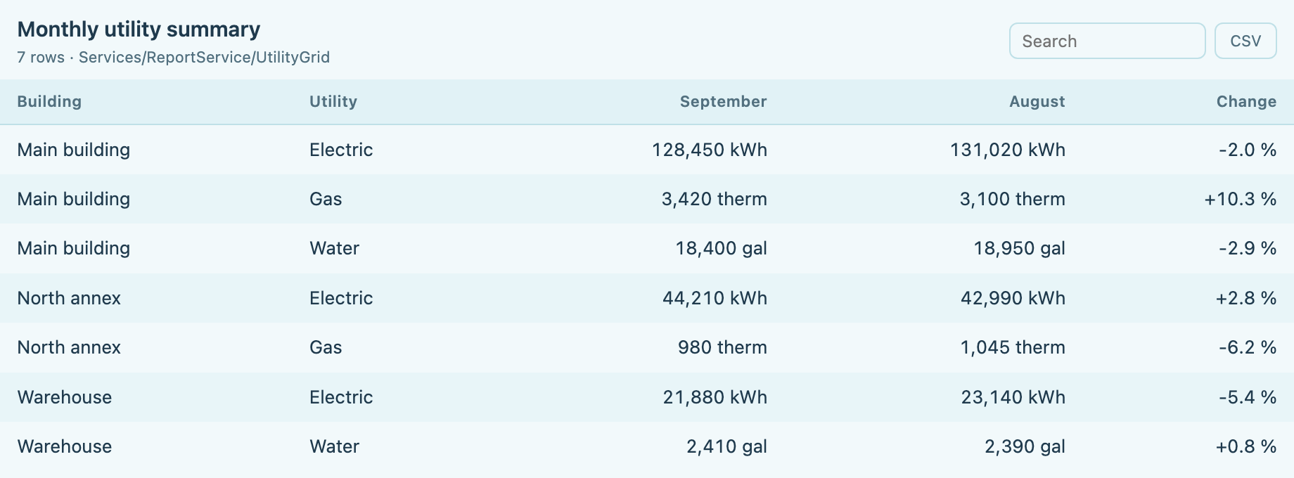
- Report Grid Table
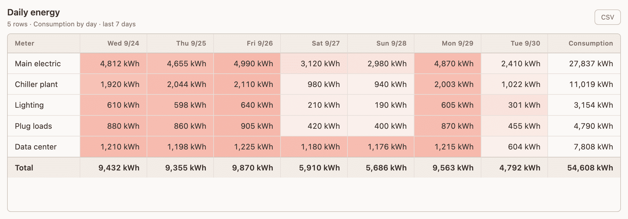
Display Report Service data in a structured, interactive grid. Match the look and feel of other tables for a consistent reporting experience. - History Rollup Table
Summarize point history by hour, day, week, or month in an organized table. View rolled-up totals to quickly analyze historical performance and trends.
Ready to Get Started?
QAGCharts puts professional-grade data visualization at your fingertips — and getting stared is just as effortless as using it. Complete our short application, and our team will approve it in no time. No lengthy paperwork, no complicated setup — just fast access to the professional-grade data visualization tool you need.
Why Choose Us for Your BAS Graphics Needs?

Reduced Lead Time
Shorten the time it takes to deliver BAS graphics by outsourcing to our dedicated graphical team

Use The Experts
Have your team focus on programming and let us take care of the BAS graphics

Efficient Graphics
Create a standard within your company to maximize a creative look and feel for your end customer

Cost Savings
Increase your ROI by saving your technicians time and your budget by reducing graphical software when you outsource with us
Learn More About Our Full Suite of Services
QA Graphics is a full-service outsourcing company, providing custom HVAC system graphics, as well as design services for interactive platforms. We help clients visualize their needs and simply their lives. Our talented designers come form a wide range of backgrounds to provide the personal attention and expertise needed to being our clients’ ideas to life. Our partnerships with industry leaders like Johnson Controls and Schneider Electric ensure high-quality BAS graphics solutions.
Who We Are
We are a full-service outsourcing company, providing custom HVAC system graphics and BAS graphics design services for interactive platforms. Helping clients visualize their needs and simplify their lives, our talented designers come from a wide range of backgrounds to provide the personal attention and expertise needed to bring our clients’ ideas to life.
All of our work is completed in-house, with a team comprised of both creative and technical staff, including graphic designers, 3D designers, developers, programmers, architects, and mechanical engineers, to ensure we meet our clients’ diverse needs. We are a fun and creative group who takes pride in our Midwestern values and affordable prices.

FAQs
QAGCharts is a Niagara 4 module that provides 19+ interactive charting and dashboard widgets powered by Apache ECharts. It ships as two JARs: QAGcharts-rt.jar for runtime types and configuration, and QAGcharts-ux.jar for the widget UI and JavaScript frontends. It requires Niagara 4.10+.
Drag a history from the History Browser onto a widget for quick viewing, or enter ORDs directly in the property sheet (pointOrd, point1Ord through point8Ord). The user guide recommends always using the property sheet for permanent dashboards, since drag-and-drop bindings may not survive a station restart.
Most multi-series widgets support up to 8 series via point1Ord through point8Ord. Single-value widgets like the KPI Card, Gauge, and Sparkline bind to one pointOrd. The Scatter Chart uses separate xPointOrd and yPointOrd bindings.
Yes. All ECharts-based widgets share color properties like backgroundColor, textColor, axisLineColor, tooltipBackgroundColor, and primaryColor. Multi-series widgets add per-series colors (point1Color through point8Color). See Section 3.6 of the user guide for the full list.
Thresholds automatically change a widget’s color based on its live value to indicate normal, warning, or alarm states. The Gauge and KPI Card support warningThreshold, alarmThreshold, and invertThresholds. The Liquid Fill uses lowThreshold and highThreshold for a similar effect.
It’s a browsing and drag-source tool — not a chart itself. Set historyParentName to a device or folder, and it displays a searchable history list. Operators can drag items onto other widgets for ad-hoc exploration, but these temporary bindings shouldn’t be relied on for saved dashboards.
Our Customers




QA Graphics did an exceptional job on the graphics for our recent project, which was full of confusing and complex systems. You would almost think that QA Graphics was part of the project from the beginning. In fact, I have been surprised many times to find that little obscure things were picked up on that I was sure would be missed. I REALLY appreciate the work QA Graphics did on this project.
JAMES PLATANIA
Senior Systems Engineer
– Johnson Controls, Inc –
I would like to throw a huge shout-out to you and your team for all the hard work on the project. After downloading the new MUI package we expected to see problems and were prepared to come back to QA with a bunch of fixes. This was not the case at all. QA really nailed it on this one and we at JCI are so thankful that you are part of the team!! This was by far the smoothest package that we have had to drop in and it really made us look good in front of this customer. This site has now become a showcase piece for future MUI sites and we are excited to show off the work that was done. Again, thanks so much for all the hard work and please let your team know how much we appreciate them going the extra mile to get this done in such a tight time frame. Looking forward to continuing the relationship and growing together as the future brings on more exciting projects.
Brett C.
Account Service Representative
– Johnson Controls, Inc –
Featured BAS Graphics Posts

As AI continues to transform industries, you might wonder why QA Graphics hasn’t fully automated the creation of BAS graphics and 3D floor plans. While AI is a powerful tool, it still falls short when handling the complexity and inconsistency of the assets you provide.

Why the visual layer needs a lifecycle standard, not just a project standard. Building automation graphics are usually built near [...]

System integrators have historically been QA Graphics’ primary customers, and that will likely continue to be the case. They have [...]

AI comes up in almost every business conversation now. Companies feel like they need to be using it. Employees are [...]